Artwork created in 2000
Behind the wall: building the Thin wall
Renderer: POV-Ray (Megapov 0.7)
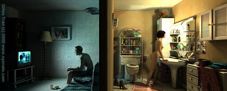
Conceptual IRTC topics like this one are easier to work on than literal ones like "Water" or "Fortress", because they allow for a lot of artistic freedom. Here the main idea came up quickly. There were several appealing prospects in it. First, I wanted to work with Michael and Victoria, the new high-resolution models from DAZ, that I hadn't used in a complete image until now. Also, making a house scene with realistic props was relatively new to me. Also, I was eager to use my newly-acquired radiosity knowledge.
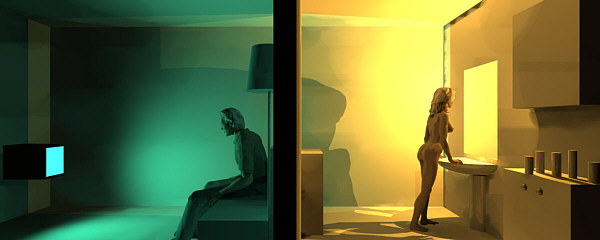
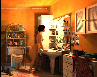
So I stopped my current project and drafted the new one in one afternoon on my portable. Version 4 looked like this:

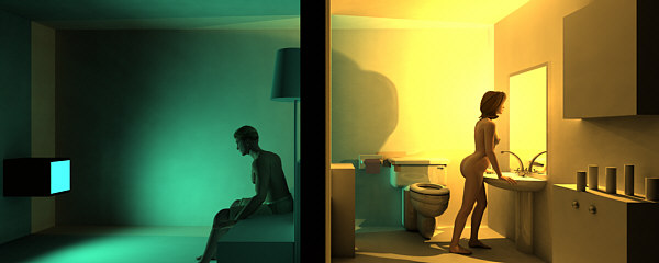
As one can see the main structure is already in place in the first draft. It used low-res Poser 3 models and placeholders for the main props. In fact, I was so impatient to use the DAZ models that I made a Vicky and Mickey version as soon as possible and downloaded a few props. See version 6:

After that, it was time to do some little work… I first dedicated my efforts to the bathroom. modeling the props, making textures etc. Version 12 is very close to the
final scene:

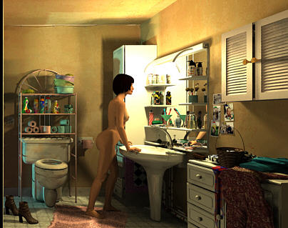
In fact, after further modeling, new textures, new hair and some clothes, I considered this part of the picture to be final in version 17.

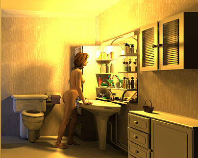
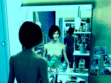
For some time, I had fun playing with another point of view. It was first done to check for some possible mistakes, but this new take became eventually an independant image, Infinity in my bathroom, that would be finished in August 2001!
I showed this image to the French povray newsgroup, and while the reaction was quite positive, a few people found the image too yellow.
Actually, I tend to drown scenes in one dominant hue, which reflects my lack of colour sophistication. So I changed the lighting and instead of having one yellow light colouring the white walls, I had a white light, yellow walls, and let radiosity do the work.
Version 19a was my first test of this new lighting environment: too red

... Version 19b was more like it.

After that, completing the left part of the house was less complicated: modeling the couch, TV, the magazine etc. There was one problem though: the image didn't feel complete. It's a common feeling with these complex images: one tends to forget the final goal. There
were two people sharing the same house, with the blue/yellow and man/woman contrasts right on the topic and so what?
The solution came from the "new angle" pic. Until then, I had used an undersea image for the TV as it projected the right blue-green glow. It didn't make sense. Why this guy would be watching fish movies?
He had already a picture of her on the wall...
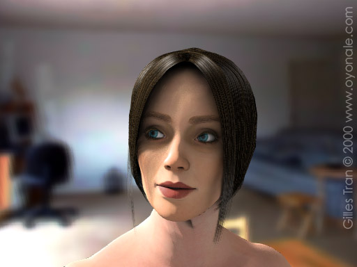
... so he might as well look at something more interesting

Now that the final piece of the puzzle was in place, I could launch the final 7-day render which ended on December 26, 2000. A larger render was made in 2001 and took forever.
Credits
Some of the objects which I modelled myself are available in the Household objects section of this website.
From left to right:
- TV: modelled in sPatch and then completed with CSG (button panel and screen). The screen is actually made of two parts: one is a transparent image map that filters the area light behind and the other (visible) one is another image map with no_shadow (so it can be seen but does not contribute to the scene lighting).
- TV table: all CSG, coded from a real life one.
- VCR: downloaded from 3D Cafe, converted to mesh2.
- Carpet: a height field made from a noisy image.
- Library: (barely visible) made with my MakeLibrary macro, with some changes in the cover pattern finishes.
- Lamp: CSG with an helix1 isosurface.
- Photo on the wall: CSG frame. The image itself is a render of a previous version of the female character.
- Cables (on the floor and ceiling): CSG using the spline function in Megapov.
- Couch: modelled in sPatch and directly exported to Povray as Bezier patches.
- Man: "Michael" Poser figure, pants and hair from DAZ. The maps are a mixture of original maps and other found in Renderosity and various Poser sites.
- Glass (in the man's hand): modelled in sPatch, imported in Poser to fit the hand.
- Halogen lamp: CSG, modelled after a real life lamp.
- Magazine on couch: modelled in sPatch, directly exported to Povray. The texture is a screenshot of web pages.
- Beer cans (on the floor and on the couch): CSG models taken from Fabien Mosen's Fridge image from the IRTC 1999 Imaginary worlds round. Maps taken from the internet.
- Remote control (on the couch): downloaded from the 3D Cafe.
- Coat hanger, light switch and toilet bowl shelves : CSG.
- Sponges (top shelf): modelled with an isosurface.
- Bottles on the shelf above the toilet bowl: CSG mixture of lathe objects made with
SpilinEditor and other primitives. Maps painted in Picture Publisher.
- Rolls of toilet paper: cylindrical isosurfaces
- Toilet bowl and toilet paper dispenser: downloaded from the 3D Cafe and converted to mesh2.
- Sink: a lathe object modelled in Spilin. The lathe was cut in two and each half scaled differently. Pipes were made with CSG.
- All pieces of furniture: CSG, with a macro to make the front parts. A bump map was used to give a better surface for some of them.
- Woman: "Victoria" figure and hair (Jim Burton's Hollywood hair) from DAZ, posed in Poser. The maps are a mixture of original maps and other found in Renderosity and various Poser sites.
- Mirror: CSG, shelves modelled after a real life one.
- Bottles and cup on the shelves: CSG mixture of lathe objects made with Spiline and other primitives. Maps painted in Picture Publisher.
- Faucet: downloaded from the 3D Cafe and converted to mesh2.
- Soap, soap holder, toothbrush, brush, lipstick tubes: CSG, modelled after real life objects.
- Toothpaste tube: modelled in sPatch after a real one, converted to obj format and uv-mapped with UVmapper, then converted to mesh2.
- Photos on the wall: Bezier patches with uv mapping of real photos. A macro makes the corners rise up.
- Basket: a Poser prop that came with Catherine Todd's "Period dress" (brokered by DAZ). The map is the original one.
- Clothes: various clothes from Victoria's clothing pack (DAZ), flattened and folded in Poser.
- Carpet and towels : height fields painted with noise in Picture Publisher.
- Floor: CSG, assembled with a macro.


